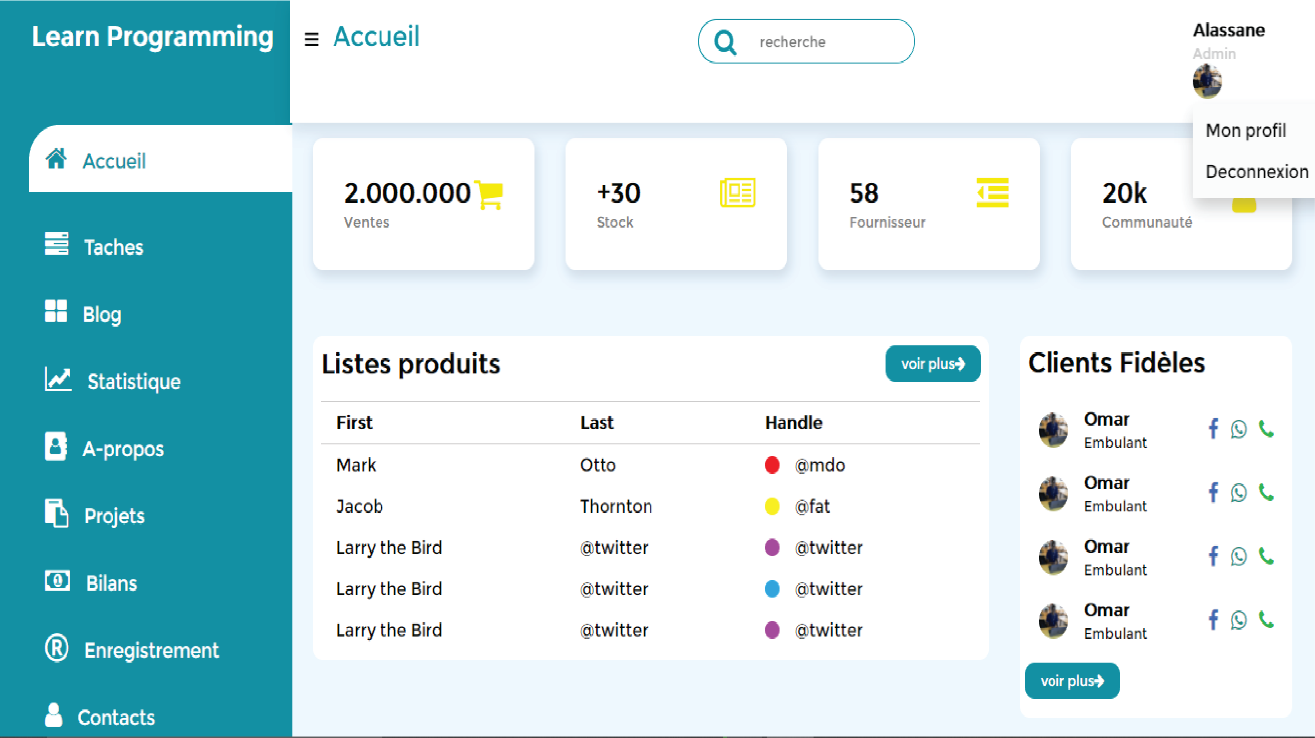
Dans ce tutoriel je vous apprends à créer un Dashboard Admin tout responsive avec du HTML et CSS uniquement.
En effet vous allez découvrir dans cet article des notions solide pour créer une interface admin adaptée à votre besoin et vous allez aussi apprendre en profondeur HTML et CSS sur les animations, les grid, flex-box, comment créer un sidebar, un menu…
Dans un premier temps vous devez télécharger Fontawesome pour les icons ou bien utilisé le lien cdn cliquez ici , si vous avez de la connexion bien évidement.
Apres avoir télécharger les outils nécessaire nous allons maintenant créer notre Sidebar en premier :
					<div class="sidebar">
		<div class="sidebar-brand">
			<h2><span class="fa fa-user-o"> </span> Learn Programming</h2>
		</div>

		<div class="sidebar-menu">
			<ul>
				<li><a href="#" class="active"><span class="fa fa-home"></span><span>Accueil</span></a></li>
				<li><a href="#"><span class="fa fa-tasks"></span><span>Taches</span></a></li>
				<li><a href="#"><span class="fa fa-th-large"></span><span>Blog</span></a></li>
				<li><a href="#"><span class="fa fa-line-chart"></span><span>Statistiques</span></a></li>
				<li><a href="#"><span class="fa fa-address-book"></span><span>A-propos</span></a></li>
				<li><a href="#"><span class="fa fa-clipboard"></span><span>Projets</span></a></li>
				<li><a href="#"><span class="fa fa-money"></span><span>Bilans</span></a></li>
				<li><a href="#"><span class="fa fa-registered"></span><span>Enregistrement</span></a></li>
				<li><a href="#"><span class="fa fa-user"></span><span>Contact</span></a></li>
			</ul>
		</div>
	</div>
le code CSS de notre Sidebar:
					*{
	padding: 0;
	margin: 0;
	box-sizing: border-box;
	list-style-type: none;
	text-decoration: none;
	font-family: 'verdana';
}
.sidebar{
	width: 300px;
	position: fixed;
	left: 0;
	top: 0;
	height: 100vh;
	background: #008ea1;
	z-index: 100;
	transition: width 300ms;
}
.sidebar-brand{
	height: 90px;
	padding: 1rem 0rem 1rem 2rem;
	color: #fff;
}
.sidebar-brand span{
	display: inline-block;
	margin-right: 1rem;
}
.sidebar-menu{
	margin-top: 1rem;
}
.sidebar-menu a{
	padding-left: 1rem;
	display: block;
	color: #fff;
	font-size: 1.1rem;
}
.sidebar-menu li{
	width: 100%;
	margin-bottom: 2rem;
	padding-left: 10%;
}
.sidebar-menu a span:first-child{
	padding-left: 1rem;
	font-size: 1.5rem;
}
.sidebar-menu a.active{
	background: #fff;
	padding-top: 1rem;
	padding-bottom: 1rem;
	color: #008ea1;
	border-radius: 30px 0px 0px 0px;
}
.content{
	transition: margin-left 300ms;
	margin-left: 22%;
}
NB: Apres la creation de notre sidebar, nous avons crée une div avec la classe content qui va englober notre contenu mais ce dernier est aussi accompagné d’une balise main. donc cela veut dire que tout le reste de notre code se trouve entre ces deux.
Pour plus de compréhension, vous pouvez aussi suivre la vidéo sur YouTube en cliquant ici
Creation de notre navbaar:
					<div class="content">
				<header>
					<p><label for="menu"><span class="fa fa-bars"></span></label><span class="accueil">Accueil</span></p>

					<div class="search-wrapp">
						<span class="fa fa-search"></span>
						<input type="search" name="" placeholder="recherche">
					</div>

					<div id="dropdown" class="user-wrapp">
						<div>
							<h4>Alassane</h4>
							<small>Admin</small>
						</div>
						<img decoding="async" src="images/pp.jpg" width="30" height="30" class="logo-admin">
						<div class="dropdown-content">
							<p>Profil</p>
							<p>Deconnexion</p>
						</div>
					</div>
				</header>
Remarque: si vous constatez bien le code, j’ai crée la div mais je ne les pas fermé; c’est à la fin du code global que vous allez le fermé.
Code CSS du navbar :
					header{
	background-color: #fff;
	display: flex;
	justify-content: space-between;
	padding: 1rem;
	box-shadow: 2px 5px 15px 2px rgb(0 0 0 / 10%);
	position: fixed;
	left: 22%;
	width: calc(100% - 22%);
	top: 0;
	z-index: 100;
	transition: left 300ms;
}
.accueil{
	font-size: 1.5rem;
	padding-right: 1rem;
	margin-left: 15px;
	color: #008ea1;
}
.search-wrapp{
	border: 1px solid #008ea1;
	border-radius: 20px;
	height: 38px;
	display: flex;
	align-items: center;
	overflow-x: hidden;
}
.search-wrapp input{
	height: 100%;
	padding: .5rem;
	border: none;
	outline: none;
}
.search-wrapp span{
	display: inline-block;
	padding: 0rem 1rem;
	font-size: 1.5rem;
	color: #008ea1;
}
.user-wrapp{
	display: flex;
	align-items: center;
}
.user-wrapp img{
	border-radius: 50%;
	margin-right: 5rem;
}
.user-wrapp small{
	color: #ccc;
	display: inline-block;
}
.logo-admin{
	cursor: pointer;
}
#dropdown{
	position: relative;
	display: inline-block;
}
.dropdown-content{
	display: none;
	position: absolute;
	background-color: #f9f9f9;
	min-width: 160px;
	height: 80px;
	box-shadow: 0px 8px 16px 0px rgba(0,0,0,0.2);
	padding: 5px;
	z-index: 1;
}
#dropdown:hover .dropdown-content{
	display: block;
	cursor: pointer;
}
.dropdown-content p{
	padding: .5rem;
}
Ainsi je vais maintenant crée la balise main qui lui aussi va se fermé à la fin du code.
					<main>
					<div class="cards">
						 <div class="card-single">
						 	<div>
						 		<h2>2.000.000</h2>
						 		<small>Ventes</small>
						 	</div>
						 	<div>
						 		<span class="fa fa-shopping-cart"></span>
						 	</div>
						 </div>

						 <div class="card-single">
						 	<div>
						 		<h2>+30</h2>
						 		<small>Stock</small>
						 	</div>
						 	<div>
						 		<span class="fa fa-newspaper-o"></span>
						 	</div>
						 </div>


						 <div class="card-single">
						 	<div>
						 		<h2>58</h2>
						 		<small>Fournisseur</small>
						 	</div>
						 	<div>
						 		<span class="fa fa-outdent"></span>
						 	</div>
						 </div>

						 <div class="card-single">
						 	<div>
						 	<h2>20k</h2>
						 	<small>Communauté</small>
						 	</div>
						 	<div>
						 	<span class="fa fa-group"></span>
						 </div>

					 </div>
					</div>
code CSS des cards:
main{
	margin-top: 80px;
	background-color: #ebf6ff;
	padding: 2rem 1.5rem;
	min-height: calc(100vh);
}
.cards{
	display: grid;
	grid-template-columns: repeat(4, 1fr);
	grid-gap: 2rem;
	margin-top: 1rem;
}
.card-single{
	display: flex;
	background-color: #fff;
	justify-content: space-between;
	padding: 2rem;
	border-radius: 10px;
	box-shadow: 2px 5px 10px 2px rgb(0 0 0 / 10%);
}
.card-single span:first-child{
	color: #f8e80c;
}
.card-single span:last-child{
	font-size: 2rem;
}
.card-single small{
	color: grey;
}
.card-single:hover{
	background-color: #008ea1;
	color: #fff;
}
Nb: vous devez aussi savoir que le code est une continuité.
Code des deux tableaux et les statistiques :
					<div class="composant">
						<div class="ventes">
							<div class="case">
								<div class="header-case">
									<h2>Listes produits</h2>
									<button class="button">voir plus <span class="fa fa-arrow-right"></span></button>
								</div>
								<div class="body-case">
									<div class="tableau">
										<table width="100%">
											<thead>
												<tr>
													<td>modou</td>
													<td>pathe</td>
													<td>demba</td>
												</tr>
											</thead>
											<tbody>
												<tr>
													<td>modou</td>
													<td>dmeba</td>
													<td><span class="status-produit color-one"></span>mass</td>
												</tr>
												<tr>
													<td>modou</td>
													<td>dmeba</td>
													<td><span class="status-produit color-two"></span>mass</td>
												</tr>
												<tr>
													<td>modou</td>
													<td>dmeba</td>
													<td><span class="status-produit color-three"></span>mass</td>
												</tr>
												<tr>
													<td>modou</td>
													<td>dmeba</td>
													<td><span class="status-produit color-four"></span>mass</td>
												</tr>
												<tr>
													<td>modou</td>
													<td>dmeba</td>
													<td><span class="status-produit color-five"></span>mass</td>
												</tr>
											</tbody>
										</table>
									</div>
								</div>
							</div>
						</div>


						<div class="stock">
							<div class="case">
								<div class="header-case">
									<h2>Clients fideles</h2>
								</div>

								<div class="body-case">
									<div class="all-users">
										<div class="infos">
											<img decoding="async" src="images/pp.jpg" width="30" height="30">
											<div>
												<h4>Omar</h4>
												<small>Embulant</small>
											</div>
										</div>

										<div class="user-contact">
											<span class="fa fa-facebook"></span>
											<span class="fa fa-whatsapp"></span>
											<span class="fa fa-phone"></span>
										</div>
									</div>


								</div>
								<button class="btn">voir plus <span class="fa fa-arrow-right"></span></button>
							</div>

						</div>


						<div class="statistiques">
							<div class="statistique-barre bar1"></div>
							<div class="statistique-barre bar2"></div>
							<div class="statistique-barre bar3"></div>
							<div class="statistique-barre bar4"></div>
							<div class="statistique-barre bar5"></div>
							<div class="statistique-barre bar6"></div>
							<div class="statistique-barre bar4"></div>
							<div class="statistique-barre bar5"></div>
							<div class="statistique-barre bar6"></div>
							<div class="statistique-barre bar4"></div>
							<div class="statistique-barre bar5"></div>
							<div class="statistique-barre bar6"></div>
						</div>


						<div class="legende">
							<h4>Legende</h4>
							<table>
								<tr>
									<td><span class="evolution color-one"></span>Riz</td>
								</tr>
								<tr>
									<td><span class="evolution color-two"></span>Mil</td>
								</tr>
							</table>
							<div class="txt-deco">
								<p>Lorem ipsum dolor sit amet, consectetur adipisicing elit, sed do eiusmod
								tempor incididunt ut labore et dolore magna aliqua. Ut enim ad minim veniam,
								quis nostrud exercitation ullamco laboris nisi ut aliquip ex ea commodo
								</p>
							</div>
						</div>
					</div>
code CSS.
					.composant{
	margin-top: 3.5rem;
	display: grid;
	grid-gap: 2rem;
	grid-template-columns: 69% auto;
}
.case{
	background-color: #fff;
	border-radius: 10px;
}
.header-case, .body-case{
	padding: .5rem
}
.header-case{
	display: flex;
	justify-content: space-between;
	align-items: center;

}
.header-case button{
	background-color: #008ea1;
	border-radius: 10px;
	color: #fff;
	font-size: .8rem;
	padding: .5rem 1rem;
	border: none;
	cursor: pointer;
}
.btn{
	background-color: #008ea1;
	border-radius: 10px;
	color: #fff;
	font-size: .8rem;
	padding: .5rem 1rem;
	border: none;
	cursor: pointer;
	margin-bottom: 1rem;
	margin-left: 5px;

}
table{
	border-collapse: collapse;
}
thead tr{
	border-top: 1px solid #ccc;
	border-bottom: 1px solid #ccc;
}
thead td{
	font-weight: 700;
}
td{
	padding: .5rem 1rem;
}
td .status-produit{
	display: inline-block;
	height: 15px;
	width: 15px;
	margin-right: 1rem;
	border-radius: 50%;
}
.status-produit.color-one{
	background-color: #ec1c24;
}
.status-produit.color-two{
	background-color: #fff200;
}
.status-produit.color-three{
	background-color: #b83dba;
}
.status-produit.color-four{
	background-color: #00a8f3;
}
.status-produit.color-five{
	background-color: #b83dba;
}
tr td:last-child{
	display: flex;
	align-items: center;
}
.tableau{
	overflow-x: auto;
	width: 100%;
}
.all-users{
	display: flex;
	justify-content: space-between;
	align-items: center;
	padding: .5rem .7rem;

}
.infos{
	display: flex;
	align-items: center;
}
.infos img{
	border-radius: 50%;
	margin-right: 1rem;
}
.user-contact span{
	font-size: 1.2rem;
	display: inline-block;
	margin-left: .5rem;
}
.fa-facebook{
	color: #4267B2;
	cursor: pointer;
}
.fa-whatsapp{
	color: #128C7E;
	cursor: pointer;
}
.fa-phone{
	color: #1DB954;
	cursor: pointer;
}
.fa-bars{
	cursor: pointer;
}
.statistiques{
	background-color: #fff;
	display: flex;
	height: 300px;
	align-items: flex-end;
}
.statistique-barre{
	flex-grow: 1;
	border: 1px solid #ccc;
	margin: 6px;
}
.bar1{
	height: 95%;
	background-color: #ec1c24;
}
.bar2{
	height: 55%;
	background-color: #00a8f3;
}
.bar3{
	height: 45%;
	background-color: #ec1c24;
}
.bar4{
	height: 85%;
	background-color: #00a8f3;
}
.bar5{
	height: 35%;
	background-color: #ec1c24;
}
.bar6{
	height: 95%;
	background-color: #00a8f3;
}
.legende{
	background-color: #fff;
	border-radius: 10px;
}
.legende h4{
	padding: 1rem;
}
td .evolution{
	display: inline-block;
	height: 15px;
	width: 15px;
	margin-right: 1rem;
	border-radius: 50%;
}
.evolution.color-one{
	background-color: #ec1c24;

}
.evolution.color-two{
	background-color: #00a8f3;

}
.txt-deco{
	padding: 1rem;
	font-weight: 500;
	color: grey;
}
Vous savez quand on vous créez votre admin vous aurez forcément besoin d’un calendrier pour pourvoir dater vos évènements et autres. ainsi nous avons à ce que vous en aurez besoin.
alors voici le code du calendrier :
<div class="calendar">
<div class="mois-annee">
<ul>
<li class="prev">❮</li>
<li class="next">❯</li>
<li>Mai <br /> <span>2021</span></li>
</ul>
</div>
<ul class="mois">
<li>Mo</li>
<li>Tu</li>
<li>We</li>
<li>Th</li>
<li>Fr</li>
<li>Sa</li>
<li>Su</li>
</ul>
<ul class="jours">
<li>1</li>
<li>2</li>
<li>3</li>
<li>4</li>
<li>5</li>
<li>6</li>
<li>7</li>
<li>8</li>
<li>9</li>
<li>10</li>
<li>11</li>
<li>12</li>
<li>13</li>
<li>14</li>
<li>15</li>
<li>16</li>
<li>17</li>
<li><span class="active">18</span></li>
<li>19</li>
<li>20</li>
<li>21</li>
<li>22</li>
<li>23</li>
<li>24</li>
<li>25</li>
<li>27</li>
<li>28</li>
<li>29</li>
<li>30</li>
<li>31</li>
</ul>
</div>
</main>
</div>
Nb: vous avez tous remarqué que c’est à la fin que j’ai fermé la balise main ainsi que la div qui contient la class content.
code CSS du calendrier :
					.calendar{
	padding-top: 2rem;

}
.mois-annee{
	padding: 70px 25px;
	width: 100%;
	background-color: #008ea1;
	text-align: center;
}
.mois-annee ul{
	margin: 0;
	padding: 0;
}
.mois-annee ul li{
	color: #fff;
	font-size: 20px;
	text-transform: uppercase;
	letter-spacing: 3px;
}
.mois-annee .prev{
	float: left;
	padding-top: 10px;
}
.mois-annee .next{
	float: right;
	padding-top: 10px;
}
.mois{
	margin: 0;
	padding: 10px 0;
	background-color: #ddd;
}
.mois li{
	display: inline-block;
	width: 13%;
	color: #666;
	text-align: center;
}
.jours{
	padding: 10px 0;
	background-color: #eee;
	margin: 0;
}
.jours li{
	display: inline-block;
	width: 13%;
	text-align: center;
	margin-bottom: 5px;
	font-size: 12px;
	color: #777;
}
.jours li .active{
	padding: 5px;
	background-color: #008ea1;
	color: #fff !important;
}
code de notre toggle barre, c’est à dire les trois barre à coté. Nb: vous devez le mettre en haut de votre code après la balise body :
<input type="checkbox" name="" id="menu">
code css :
					#menu:checked ~ .sidebar{
	width: 60px;
}
#menu:checked ~ .sidebar .sidebar-brand, h2 span:last-child,
#menu:checked ~ .sidebar li a span:last-child{
	display: none;
}
#menu:checked ~ .content{
	margin-left: 60px;
}
#menu:checked ~ .content header{
	width: calc(100% - 60px);
	left: 60px;
}
code pour gérer la responsivité avec les média queries :
@media only screen and (max-width: 960px){
	.cards{
		grid-template-columns: repeat(3, 1fr);
	}
	.recent-grid{
		grid-template-columns: 60% 40%;
	}
}
@media only screen and (max-width: 768px){
	.cards{
		grid-template-columns: 100%;
	}
	.composant{
		grid-template-columns: repeat(1, 1fr);
	}
	.search-wrapp{
		display: none;
	}
	.sidebar{
		left: -100% !important;
	}
	header p{
		display: flex;
		align-items: center;
	}
	header p label{
		display: flex;
		padding-right: 0rem;
		margin-right: 1rem;
		height: 40px;
		width: 40px;
		border-radius: 50%;
		color: #fff;
		align-items: center;
		justify-content: center !important;
		background-color: #008ea1;
	}
	header p span{
		text-align: center;
		padding-right: 0rem;
	}
	.content{
		width: 100%;
		margin-left: 0rem !important;
	}
	header{
		width: 100% !important;
		left: 0 !important;
	}
	#menu:checked ~ .sidebar {
		left: 0 !important;
		z-index: 100;
		width: 45%;
	}
	#menu:checked ~ .sidebar li a{
		padding-left: 1rem;

	}
	#menu:checked ~ .sidebar .sidebar-brand,
	#menu:checked ~ .sidebar li{
			padding-left: 2rem;
			text-align: left;
	}
	#menu:checked ~ .sidebar .sidebar-brand, h2 span:last-child,
	#menu:checked ~ .sidebar li a span:last-child{
		display: inline;
	}
	#menu:checked ~ .content{
		margin-left: 0rem !important;
	}
}
@media only screen and (max-width: 560px){
	.cards{
		grid-template-columns: 100%;

	}
}
@media only screen and (max-width: 1200px){
	.sidebar{
		width: 60px;
	}
	.sidebar .sidebar-brand, h2 span:last-child,
	.sidebar li a span:last-child{
		display: none;
	}
	.content{
		margin-left: 60px;
	}
	.content header{
		width: calc(100% - 60px);
		left: 60px;
	}
}
10 comments
Got a recommendation on youtube to your channel.
You explain it well, good job.
Thank you very much it’s really nice of you
Keep on working, great job!
Great post! We will be linking to this great article on our website.
Keep up the good writing.
When someone writes an piece of writing he/she retains the idea
of a user iin his/her mind that how a user can knoww it.
Therefore that’s why tis post is amazing. Thanks!
My brother suggested I might like this blog. He was totally right.
This post truly made my day. You cann’t consider simply how a lot time
I had spent for this information! Thanks!
After checking out a few of the articles on your
web page, I honestly like your technique of writing a blog.
I bookmarked it to my bookmark webpage list and will be checking back soon.
Take a look at my web site too and tell me what
you think.
What’s up, just wanted to say, I loved this blog post. It was helpful.
Keep on posting!
Pretty! This was an extremely wonderful post.
Thank you for providing this info.
All you have to do is add “ss” to the URL of the
YouTube video you want to download.